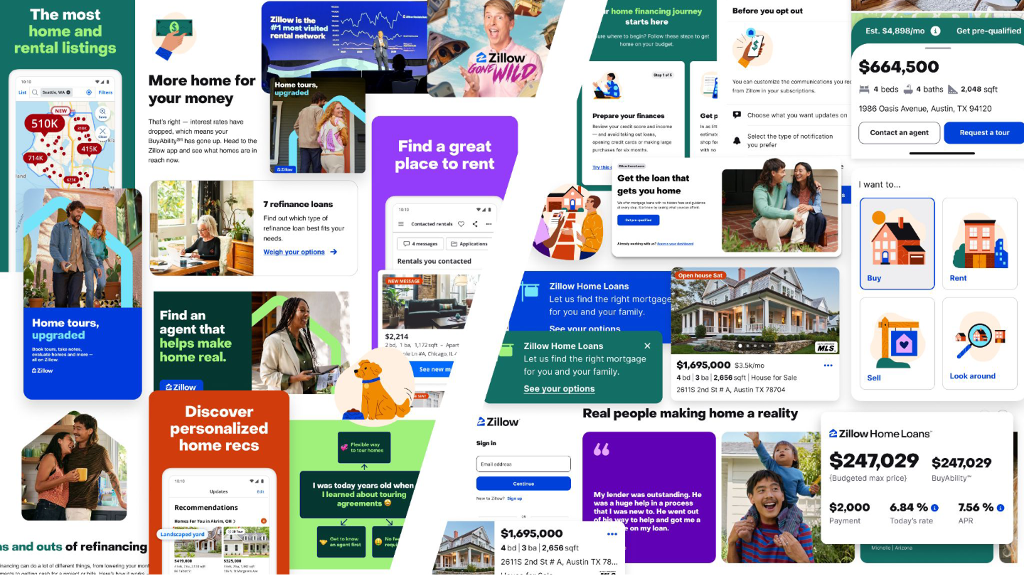
Zillow CMS WEB Design System
Scope
Extending a product design system into a CMS platform used across thousands of Zillow.com pages.
Role
Principal UX/UI Designer
Team
Led two Senior UX/UI Designers, partnered across all PEMD (Product, Engineering, Marketing, Design).
Duration
24 months
rebrand exposeS KEY systems problem.
In early 2019, Zillow's Premier Agent main revenue generating business was preparing for an aggressive rebrand. Its digital ecosystem had grown across internal teams and external agencies: hundreds of landing pages, multiple blogs, peripheral sites, self-service tools, and critical product experience doorways. The result was fragmented—different layouts, implementations, assets, and levels of quality.
Applying a new visual identity page by page wasn't going to scale.
Synthesizing visual design problems across all web.
At the same time, Zillow already had Constellation, its product design system. Premier Agent used its own flavor of Constellation, Premier Agent Expression Language (PAXL), but those foundations largely stopped at the product experience.
Marketing, web, and editorial had no equivalent system for carrying the Premier Agent brand consistently across the broader agent journey on Zillow.
What looked like a rebrand project was really an opportunity to extend Zillow’s design system into a scalable publishing environment.
My first challenge was understanding what actually existed, finding the system hiding inside hundreds of pages.
Database audit; all URL-bound content + interactions.
Once the pages were systematically analyzed and deconstructed, the problem changed. Hundreds of seemingly different pages were actually combinations of a much smaller vocabulary, that needed to be recognized and written down. Hundreds of pages could be recreated with a handful of new, flexible content interaction patterns. Masthead heroes, Forms, Value & Pricing Features, Media Elements, Social proof & review visualization, Call to actions, etc.
Instead of redesigning every page, I architected a shared system of templates, patterns, and components capable of reproducing the ecosystem—and whatever came next.
Extending Constellation, not creating another design system
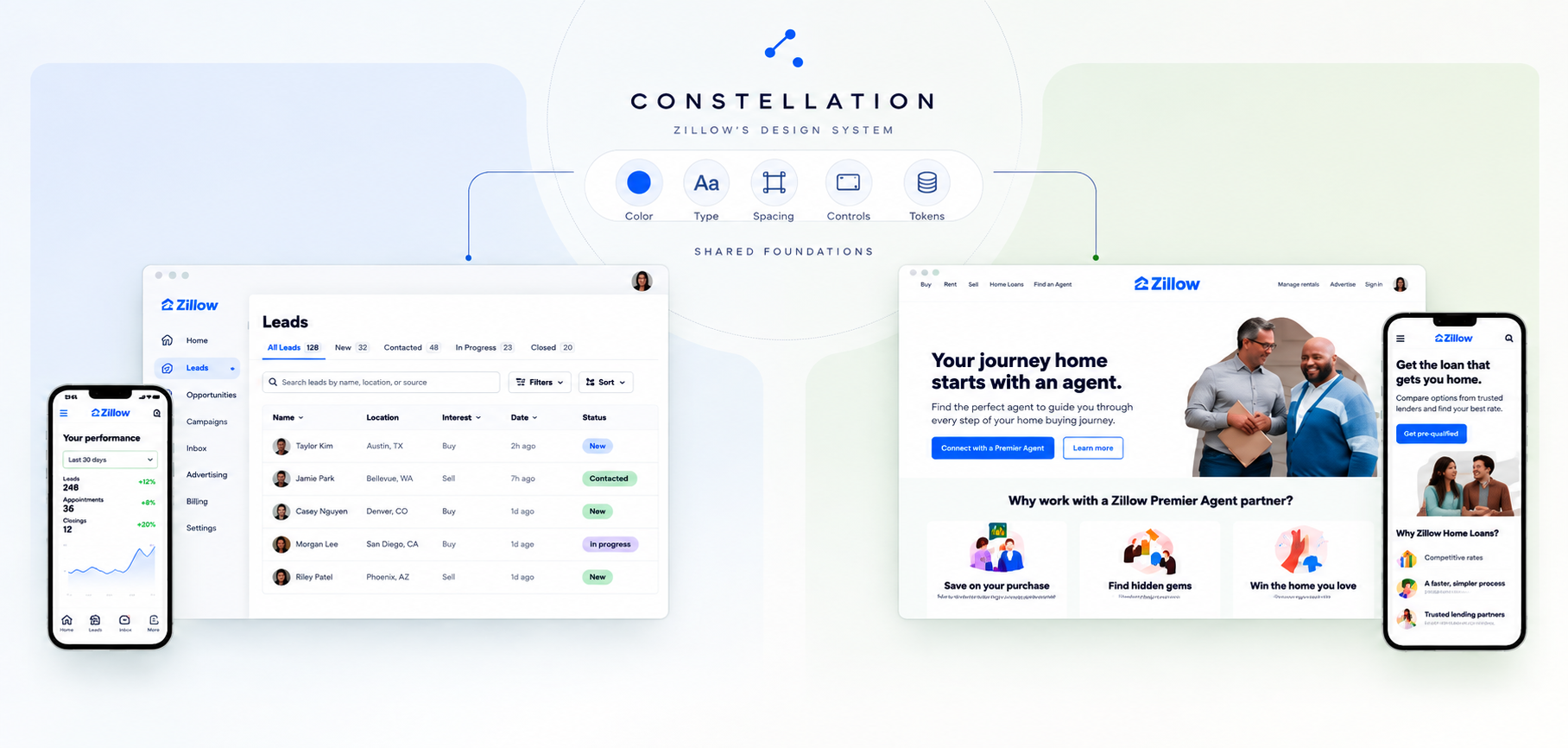
Balancing functional -> expressive style.
We deliberately avoided creating an independent marketing design language. Instead, we connected the new system to Constellation, sharing Zillow's foundational product design tokens & styles while extending them for marketing and editorial use.
Common pattern language for any element.
The distinction mattered. A product dashboard, especially on a mobile device came with more information density, visual efficiency, and compact task-oriented patterns. Yet, a marketing page needs space, storytelling, expressive imagery, persuasion, and different typographic relationships. So rather than fork the system, we extended it.
Product and marketing could share a foundational surface for their product and product marketing shipments.
That created a continuum between brand and product—and allowed experiences that crossed the boundary between the two to still feel like Zillow.
Tap image to see more pattern examples.
One page. Dozens of possibilities.
At the center of the system was what I came to call the Swiss Army landing page.
Rather than creating a bespoke template for every campaign landing page, we designed a flexible page architecture containing roughly 25 interchangeable, responsive patterns.
A content author on the back end could stack, edit and customize their page using these patterns to create dramatically distinct but cohesive brand surfaces for web without leaving the system.
Below the hero, authors could assemble benefits, features, social proof, media, product explanations, article collections, forms, and calls to action.
The goal wasn't unlimited flexibility. It was constrained flexibility: enough freedom to tell different stories without reinventing the page every time.
The ‘hero pattern’ would adapt across: left or center-aligned compositions, photography, illustration, video, texture, or color, different CTA configurations, embedded or modal forms, varying content lengths and responsive image treatments.
Every component has two sides.
This became one of the defining ideas behind the system. A component wasn't finished when the customer-facing UI looked good. Every pattern also needed an intuitive author-facing experience inside WordPress. A configurable hero on the front end meant deciding how its options appeared in the CMS. A responsive image meant defining asset requirements. Flexible copy meant defining useful minimums and maximums. Reusable content meant thinking through taxonomy, relationships, and content models.
So we designed both sides together:
Customer experience
Responsive layout · interaction · brand · imagery · conversion
Author experience
Fields · options · validation · character limits · asset rules · taxonomy · reusable content
This moved the work beyond a traditional UI library.
The design system became an agreement between design, content, engineering, and publishing.
Every page was created and edited through dynamic content modules.
Designing the entire page stack
What customers saw was only the top layer. Designing the page meant designing how all of these layers worked together. Every published page was the result of an interconnected stack:
Authoring experience
WordPress, custom post types, settings, page creation & publishing workflows
Data
Content relationships, metadata, underlying database structures, instrumentation, marketing automation, split testing
Measurement
Clicks, hovers, scroll depths, heat maps, form completion, qualitative surveys, content experimentation
Brand & presentation
Typography, color, spacing, photography, illustration, icons, responsive web browser & device behavior
Interaction patterns
Heroes, lead and authentication forms, navigation, CTAs, content modules & conversion patterns
Content architecture
Templates, modules, components, asset rules, character limits, taxonomy terms, reusable content
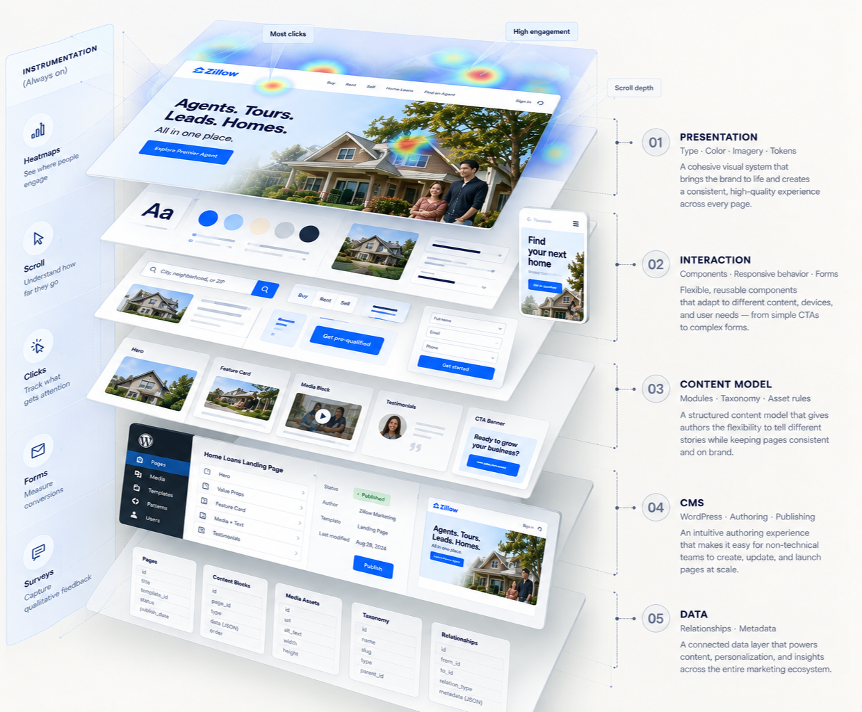
CMS Built Web page anatomy
Designing for reality, not perfect inputs
The rebrand deadline introduced another constraint: we inherited hundreds of existing assets.
Many had never been designed for modern responsive layouts. An image might look fine at one desktop width but fall apart when stretched across an ultrawide screen—or become meaningless when cropped onto a phone.
Remaking everything wasn't an option.
Instead, we made resilience part of the system.
Hero patterns could accommodate different image proportions and qualities, switch composition across breakpoints, or fall back to illustration, video, texture, or color when photography wasn't appropriate.
This became a principle I carried forward:
Don't design systems only for ideal content. Design for the content an organization actually has.
The system learned
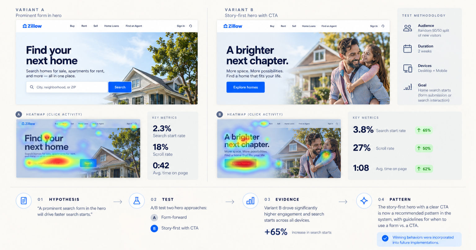
Note: real results & data remain private.
As adoption grew, the platform also gave us something individual campaign pages couldn't: reusable evidence.
We could see how different layouts, copy, buttons, and interactions performed.
Forms became a particularly rich area of experimentation. We explored how much of a form to expose initially, when to use a modal, how to sequence questions, and how to reduce abandonment through the flow.
Behavioral instrumentation—including clicks, scroll depth, heat maps, hover behavior, and qualitative surveys—helped us understand what was working.
Those learnings could then move back into the patterns used by the next campaign.
The system wasn't static. Every page could make the next page better.
Different jobs. One underlying system.
The architecture eventually had to support experiences well beyond traditional landing pages.
Premier Agent included self-service experiences where agents could select ZIP codes, determine advertising spend, purchase leads, sign in, and move into authenticated product experiences.
Editorial presented a different problem again.
The blog used a smaller, more purposeful set of templates optimized for reading and discovery: article pages, lists, author pages, information hubs, and occasional editorial experiences that behaved more like landing pages.
Marketing optimized for persuasion.
Editorial optimized for reading.
Product optimized for tasks.
They could behave differently while still belonging to the same Zillow ecosystem.
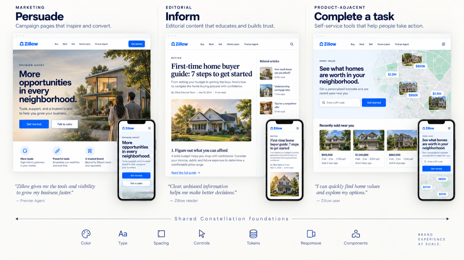
Brand systems must anticipate and accommodate the medium and user context.
From one business to thousands of pages
The system started with a B2B rebrand for Premier Agent.
Then other teams began asking to use it.
It expanded into consumer-facing Zillow work and supported major initiatives including Zillow Offers, COVID information experiences, editorial publishing, campaigns, landing pages, information hubs, and product-adjacent experiences.
Internal creative teams used it.
External studios used it.
Marketers and content authors used it.
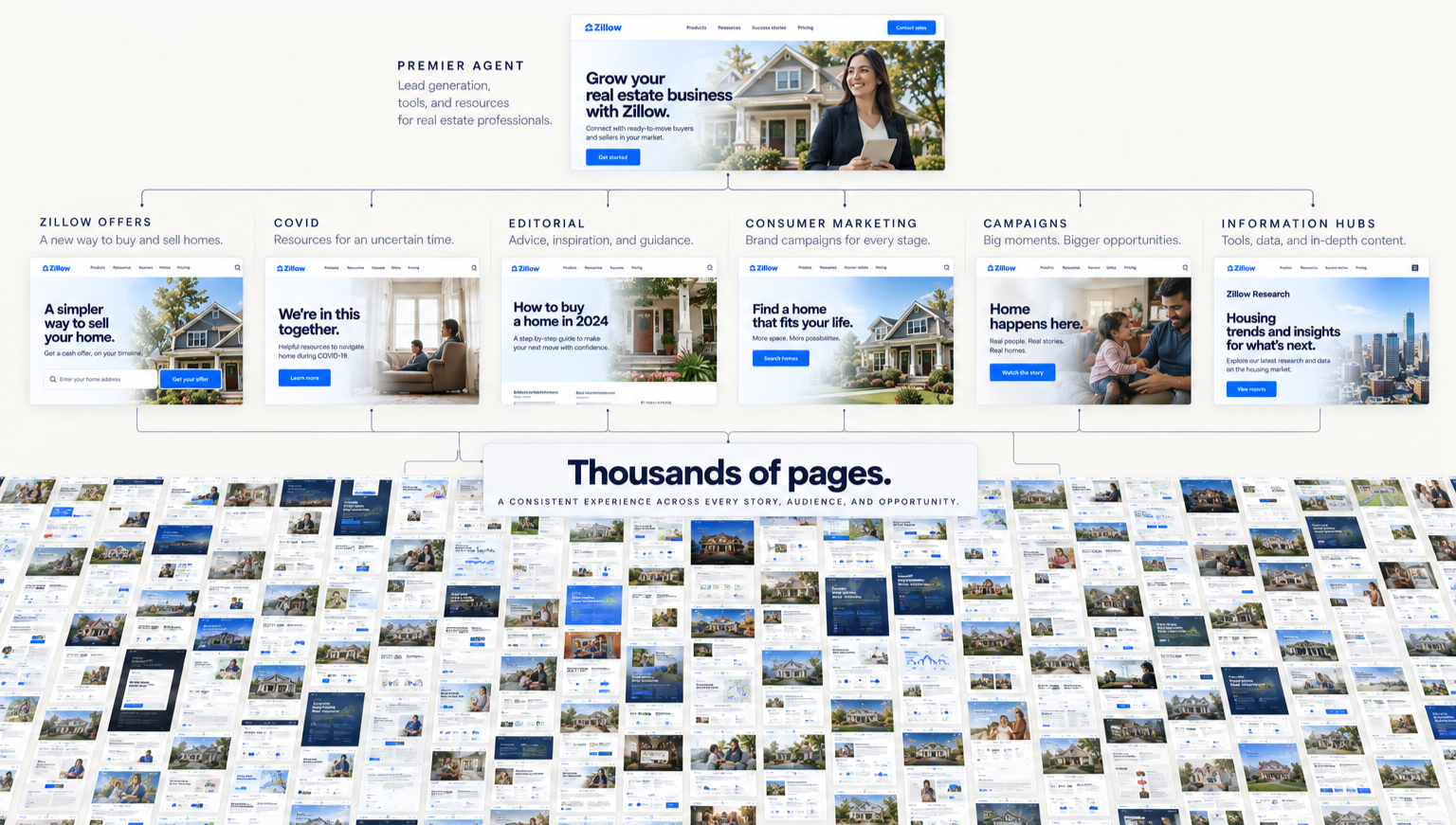
System Illustration
The library moved from Sketch to Figma. Its patterns mapped into a React front end and a React-powered WordPress authoring experience. Documentation, content limits, asset requirements, and usage guidelines helped teams work independently while maintaining quality.
Over the following years, the platform supported thousands of pages across Zillow.
What began as a way to survive an aggressive rebrand had become shared infrastructure.
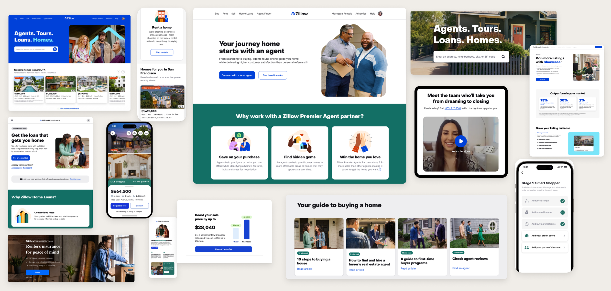
Visual Refresh Treatment, applied in 2024
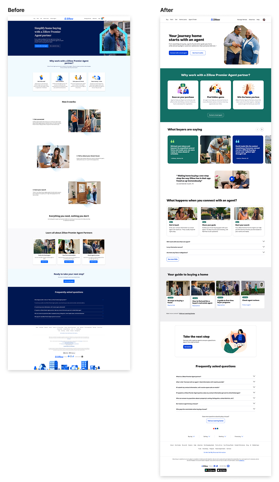
Before (left) and After (right).